
“We’re very proud of the new website and feel it is a fantastic representation of the work we undertake here at the Earth Observatory of Singapore. I would like to thank the team at Bray Leino Splash for their dedication in partnering
with us for this project”.
Andrew Krupa,
Director, CPO & Director of Advancement, EOS.
BUSINESS CHALLENGES
The Earth Observatory of Singapore (EOS) conducts research on earthquakes, volcanic eruptions, tsunamis and climate change to help create safer and more sustainable societies.
We were tasked to redesign the site to be in line with their sustainable ethos.
One of the biggest web sustainability gains comes from switching to green hosting. This however was not a viable option at the time.
We therefore had to focus on other areas such as UX and visual design to bring sustainable website design principles to bear.
APPROACH
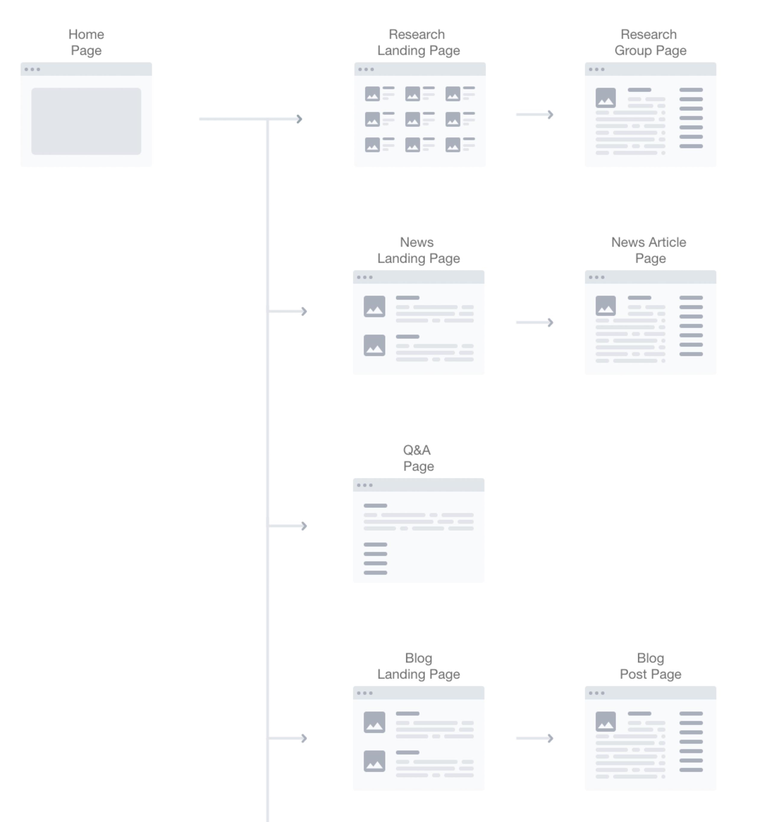
Simplifying the user experience
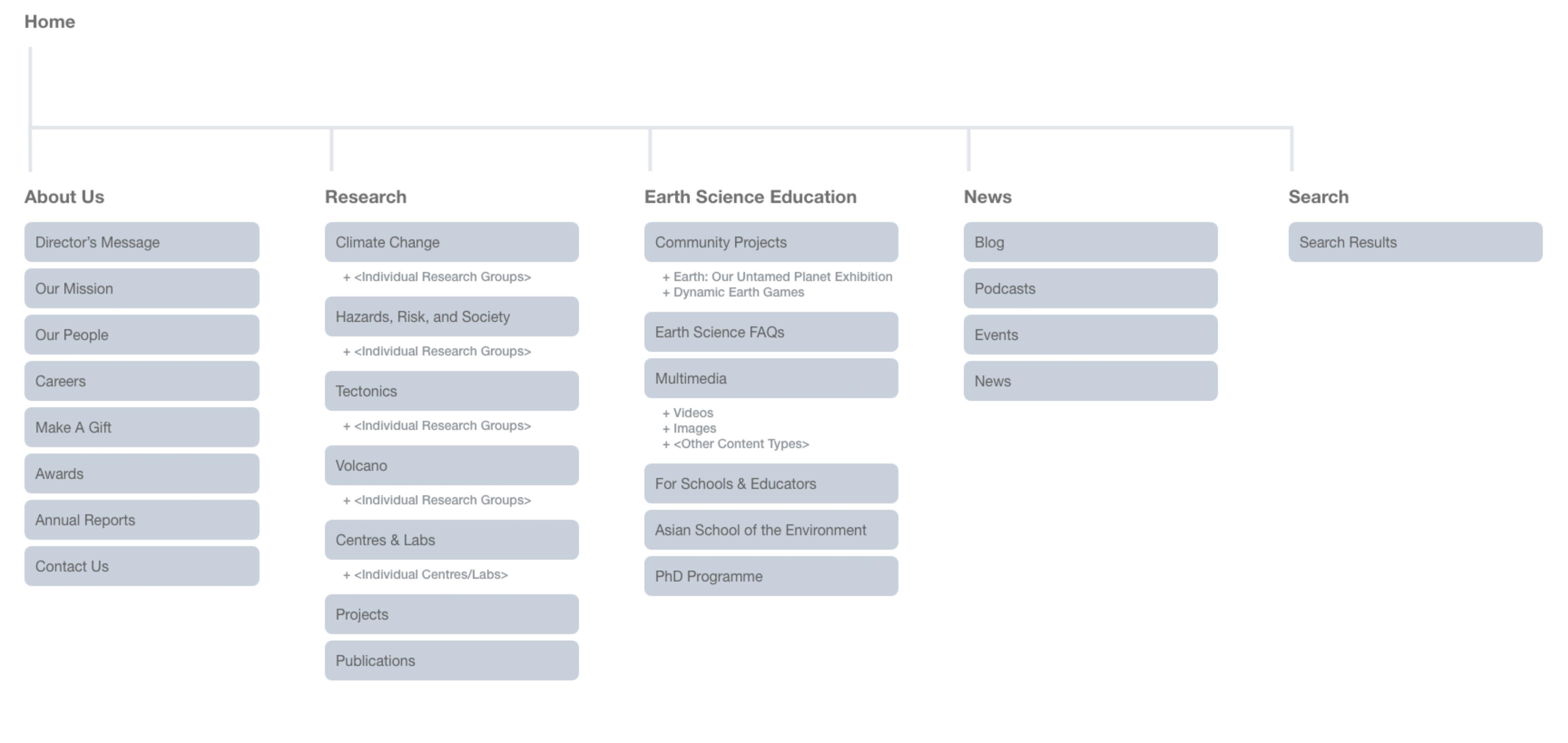
Our work started with gathering feedback from the customer-facing teams. Together with user data from site analytics, we created user journeys for customers to get faster, easier access to the most frequently browsed content on
the site.
From analysing the pages with high bounce rates, we were able to streamline over 10,000 pages of content from the research pages.
This reduced the number of templates and increased re-usable components throughout the site, making it more efficient and cost-effective.
Streamlining Workflows & Features
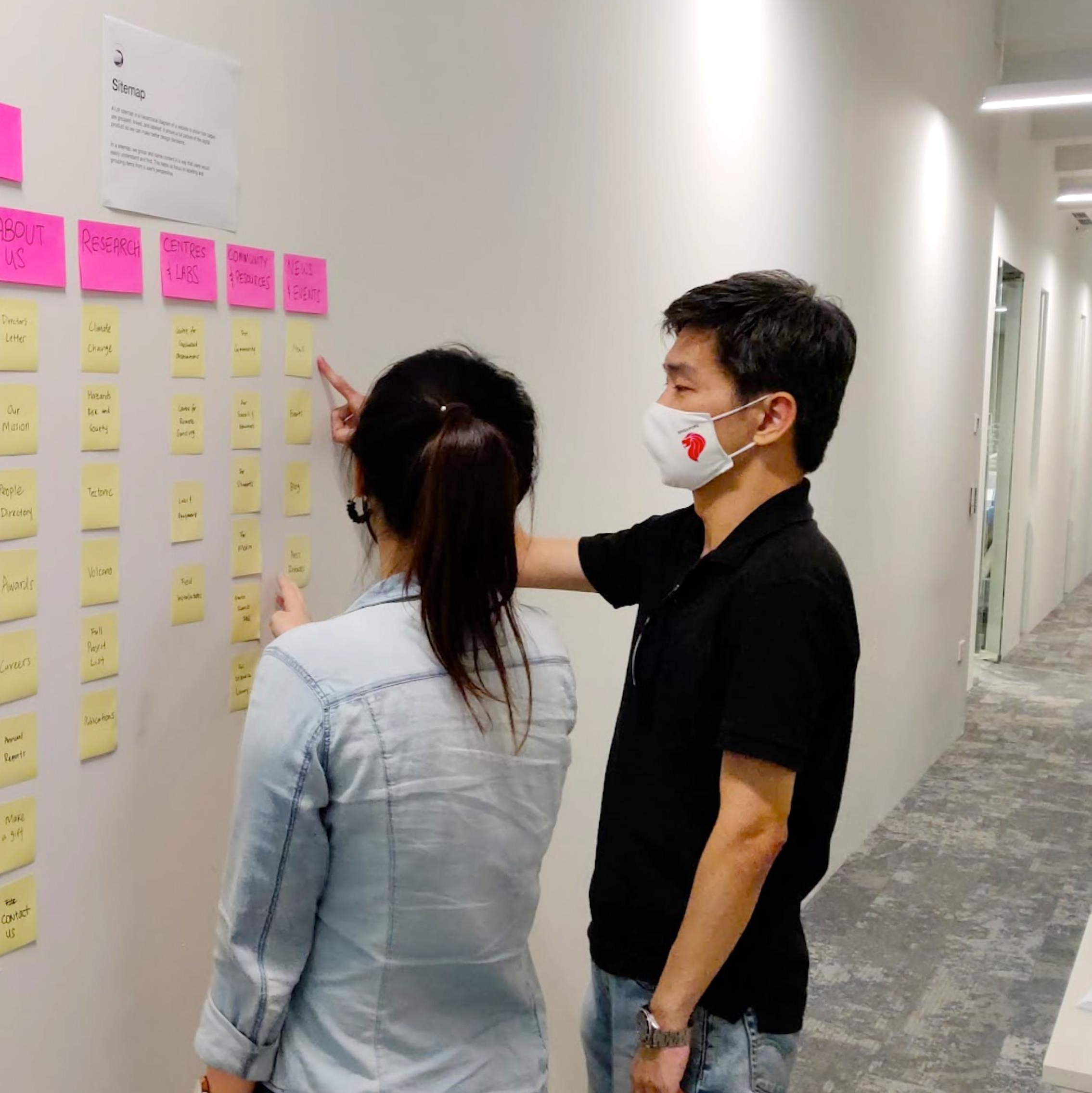
We kept workflows lean & agile by meeting early and often with stakeholders to design solutions In client reviews, project management controlled feature sets by asking questions like “Is this a nice-to-have?” and “Can we do without
it?” to really go with what the users needed.
Darker, warmer screen colours
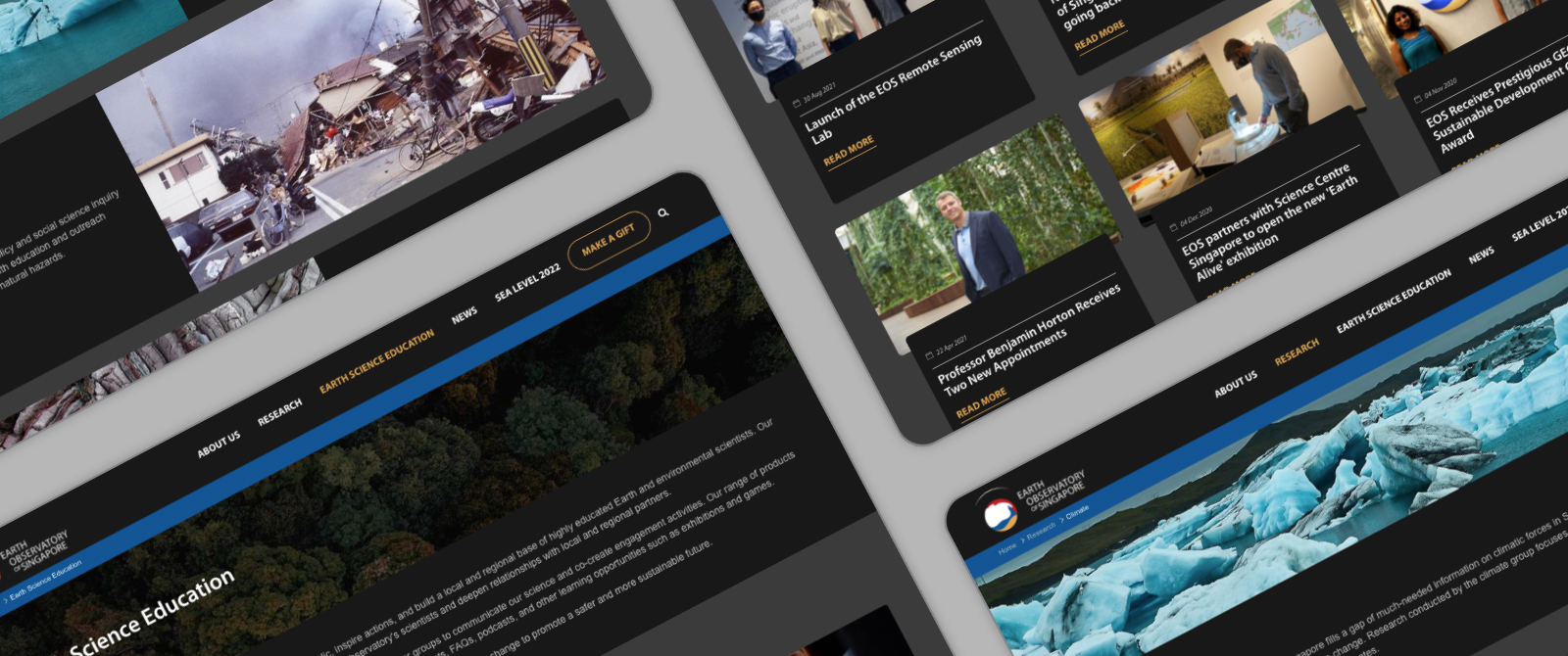
If dark mode was proven by Google to reduce electrical consumption and increasing battery life, why not stay dark by default?
The visual design avoided pure white and used light colours on text for clarity and legibility. Black was used where possible for high energy savings on OLED displays.
Efficient typography
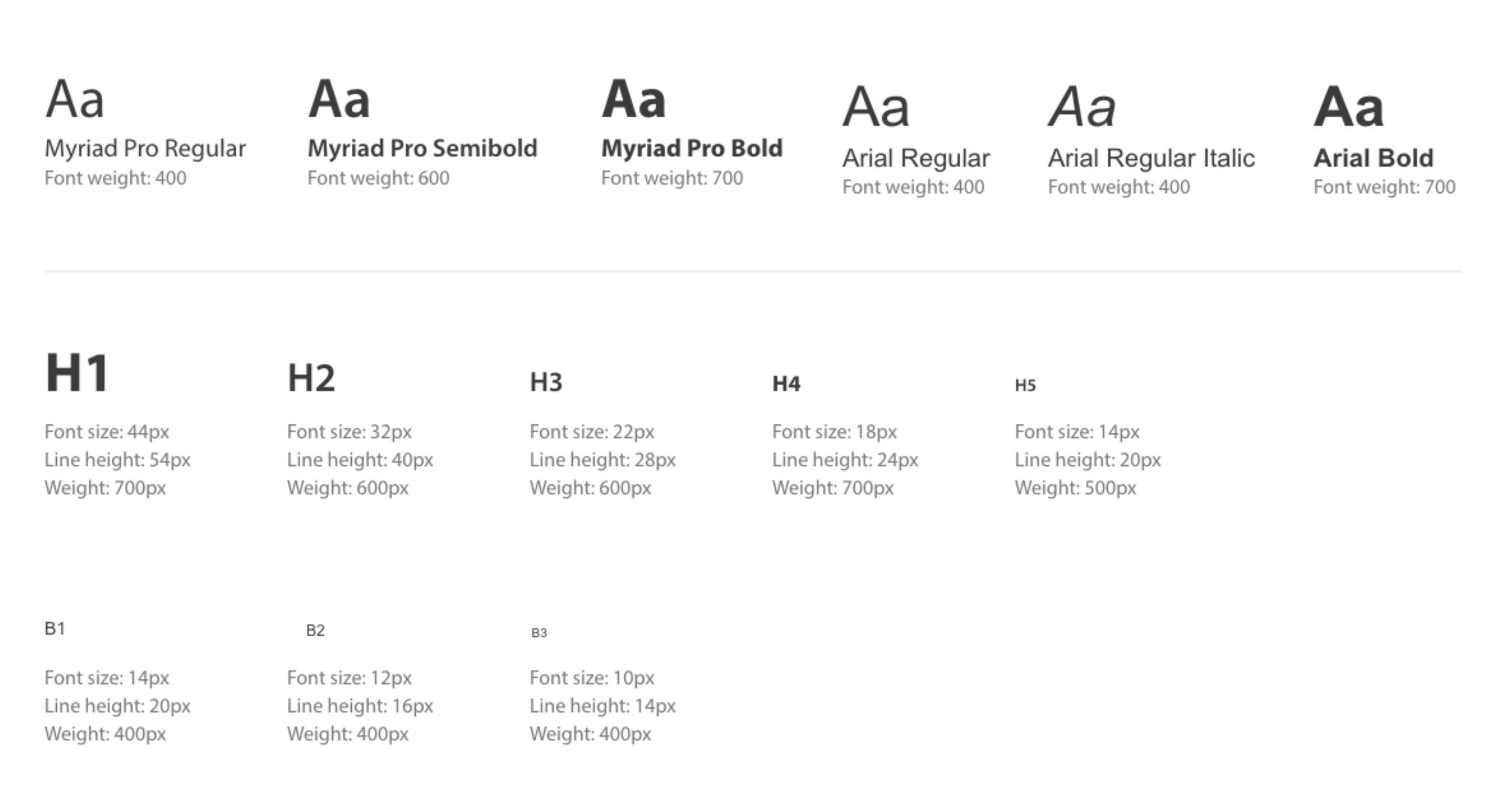
On one hand, using web fonts for everything would have enabled enhanced aesthetics but with a download penalty. On the other hand, using only system fonts would have limited us from using brand typography effectively.
We came to a compromise of using only one web font for headlines and system defaults everywhere else.
Media optimisation
Embedding social media videos into websites is common practice. But embedding a YouTube video into a page pulls in an extra 500KB of data — this is extraneous data consumptions even before a user clicks to watch the video.
So instead of default Youtube embeds, we used a 50KB video thumbnail image and only loaded the video in a modal when the user clicks the image resulting in less data consumption while not compromising the user experience.
BUSINESS OUTCOMES
- Comparing the before and after versions of the website, we are proud to have lowered CO2 emissions of the website by over 60%. (Source: https://www.websitecarbon.com/)
- A fully responsive mobile first design that avoided pure white and used light colours on text for clarity and legibility. Black was used where possible for high energy savings on OLED displays.
- Presentation of important research conducted by EOS in an intuitive and easy way to create shorter user journeys to save energy by reducing the amount of time spent online and the number of pages loaded for users to accomplish their goals.
- Media optimisation of all educational videos and images on site to reduce data and energy without compromising user experience.
- Simplified workflows on the Sitefinity platform that drastically reduced the effort required to publish and amend content
- New education section design specifically for school students researching Earth Science.


